Swidge
A modular, context based deadline and scheduling tool.
TYPE
Solo Project
ROLE
End to end UI/UX Process
TIMELINE
6 Weeks
PLATFORM
Web Application
Problem
Students struggle to manage deadlines across multiple aspects of life
I’ve always found myself juggling multiple schedulers and task managers, for different aspects of life. It felt scattered and inefficient. I wanted a single, calm space where everything could live without feeling bloated or rigid.
Solution
A task manager application built with modularity, dashboards and context-aware overviews.
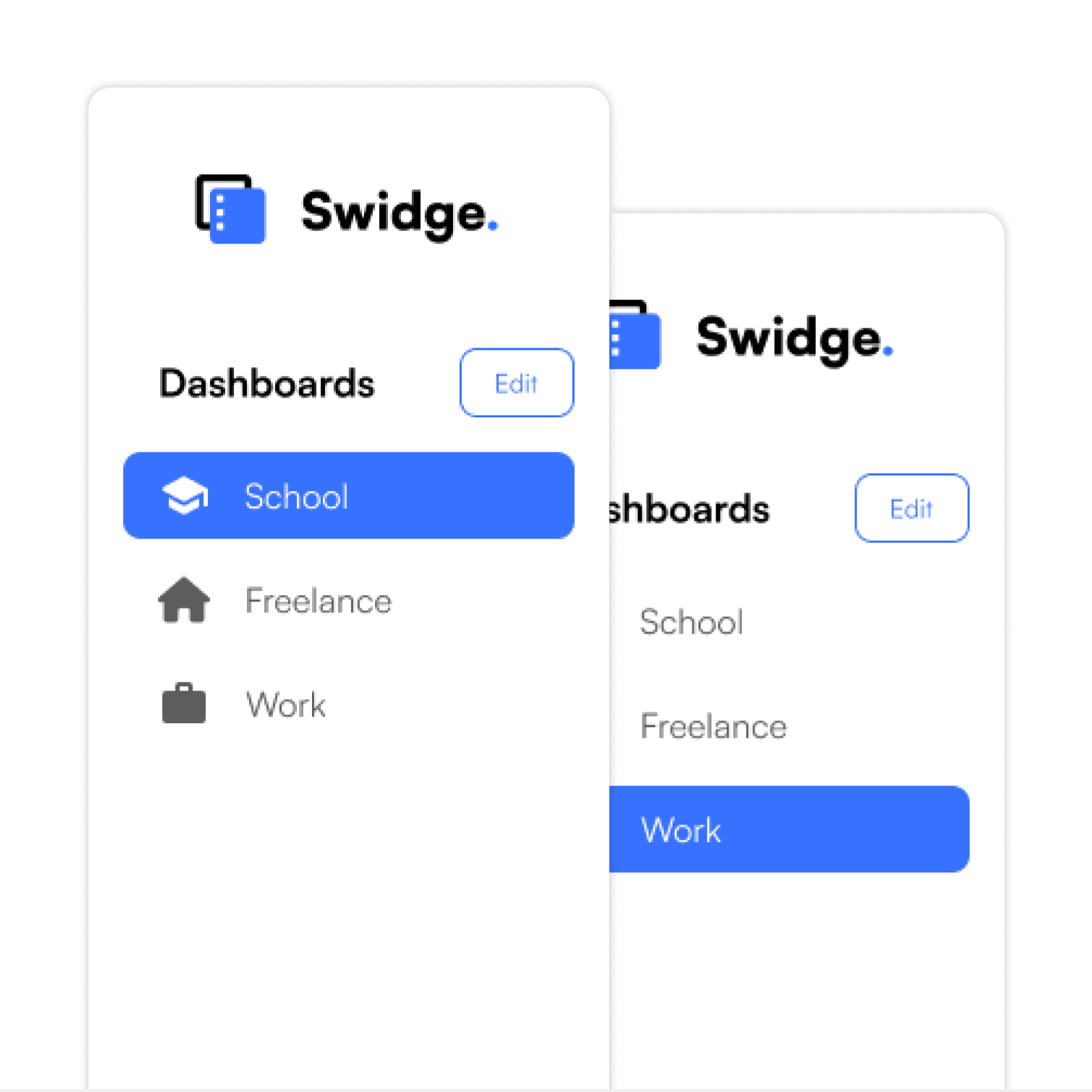
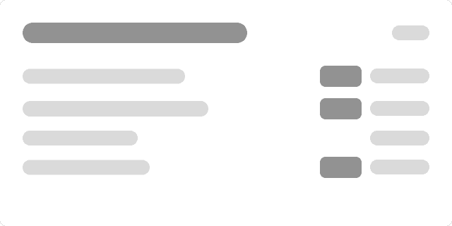
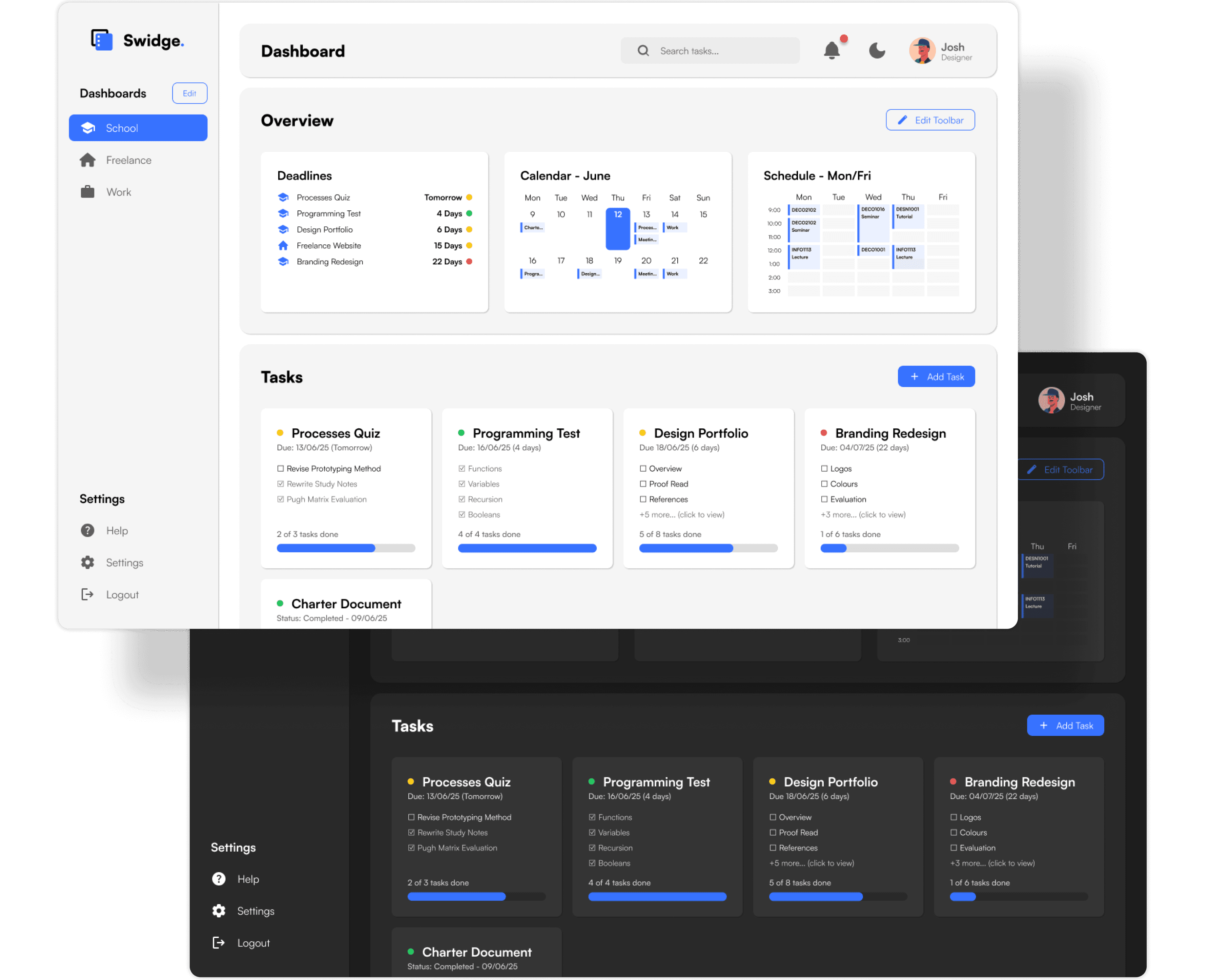
Modular Dashboards for Every Context
Effortlessly switch between dashboards to reduce cognitive overload.
Visually separate your tasks by context to stay organised.
Customise each dashboard to match your workflow, priorities, and focus.
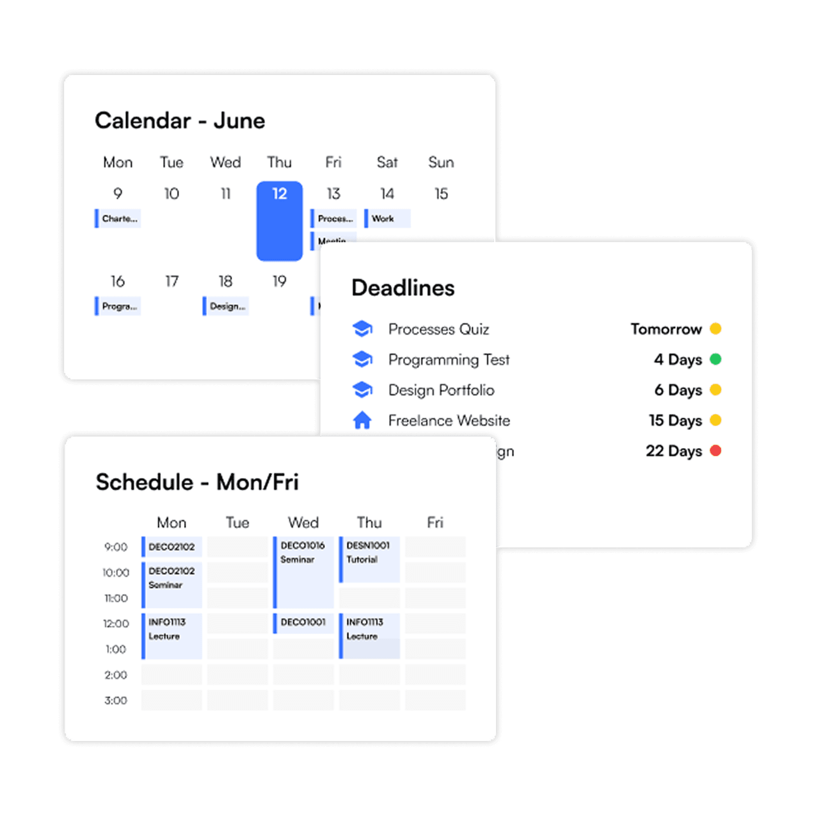
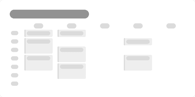
Unified Overviews Across Dashboards
Overview cards offer quick insight into tasks across all dashboards.
A dedicated overview section ensures visibility without cluttering your workflow.
Smart widgets align with task types, surfacing what matters most at a glance.
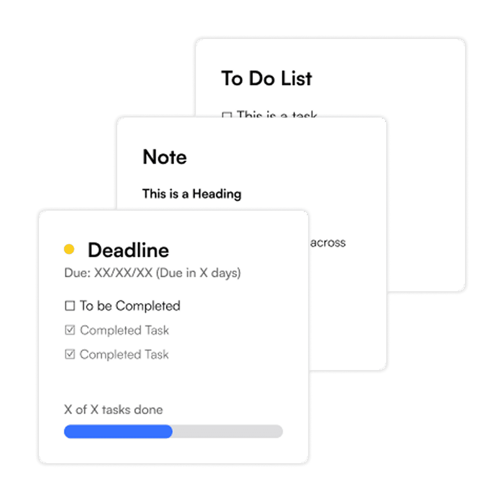
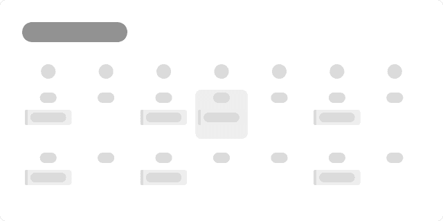
Versatile Task Cards
Choose from a variety of card types designed for notes, deadlines, progress and more.
Visual indicators reflect urgency, with colour coded highlights based on upcoming due dates.
Track progress within the card and view completion without clicking deeper.
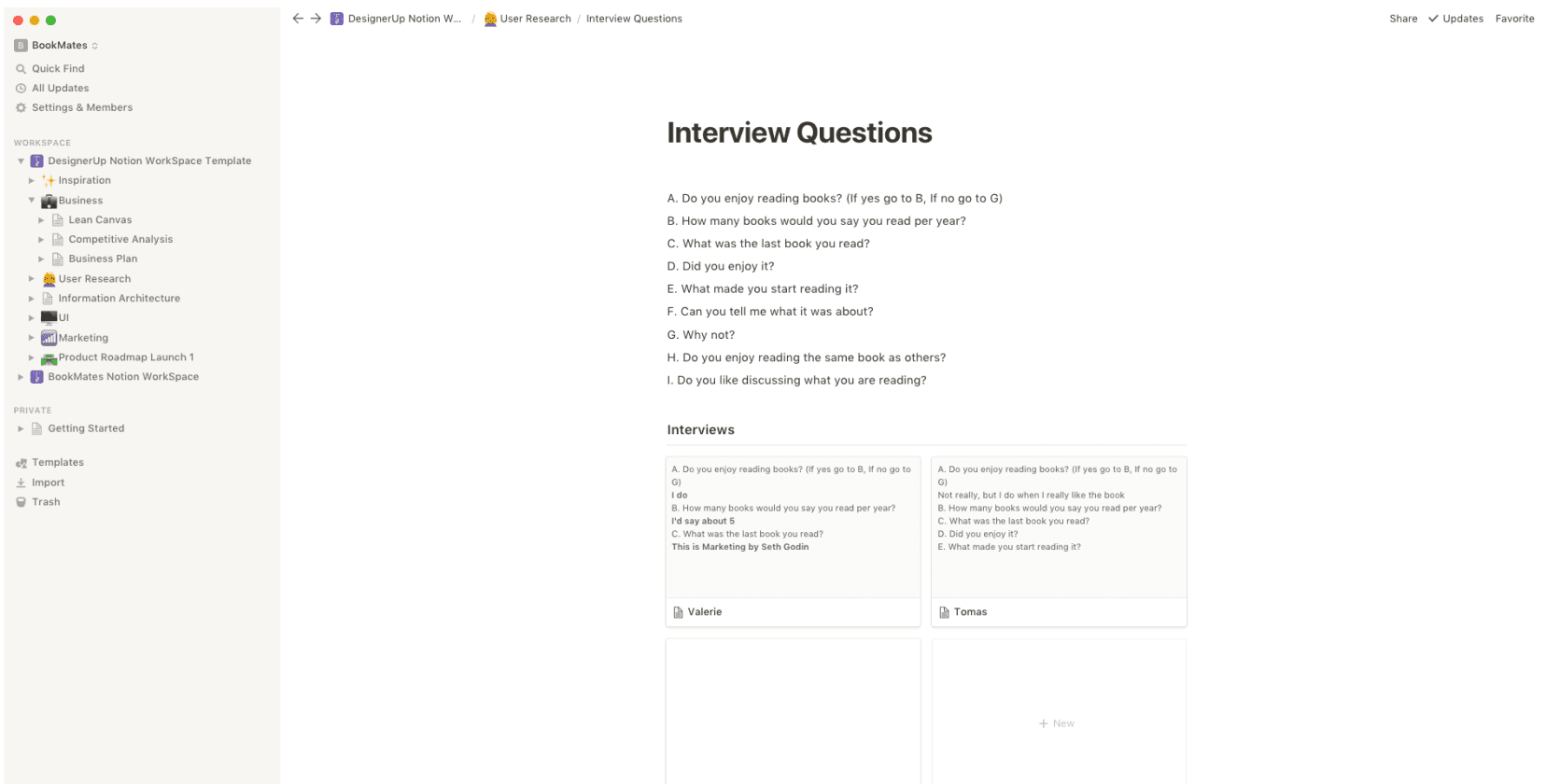
User Research
Survey found 63% of users struggle to prioritise tasks.
I’ve always found myself juggling multiple schedulers and task managers, for different aspects of life. It felt scattered and inefficient. I wanted a single, calm space where everything could live without feeling bloated or rigid.
Insights
63%
Reported difficulty in managing their priorities,
50%
Have difficulty keeping track of varying tasks.
88%
Use task management tools multiple times a week
75%
Want dedicated dashboard for distinct contexts
Research backed decisions
Automating summaries and organising tasks by context will help users prioritise effectively, keep track and manage all areas of life at a glance.
Design Precedents
Task managers fail to balance simplicity with versatility
Notion
Super flexible, but lacks task-specific structure
Can feel overwhelming without tight organisation
Not ideal for quick glance planning or contextual clarity
Todoist
Great for fast task entry and completion
Lack spatial and visual grouping for multitasking
Doesn’t scale well across contexts or dashboards
User Persona
Finding focus areas through empathetic personas

Jess
Age: 22
Role: University Student + Freelance Designer
Pain Points
Overwhelmed managing tasks across contexts
Finds other task managers too complex
Struggles to see what urgent
Wants something simple and easy to use
Goals
A place to see everything in one glance
Keep university and freelance task separate
Have a sense of calm control and progress
Avoid overly technical interfaces
Ideation and Wireframes
Converting a concept into a tangible product
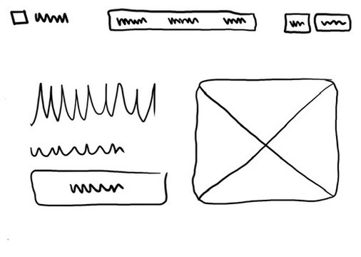
Landing Page Sketches
While sketching landing page ideas, I aimed for something that felt minimal, clear, and visually refined.
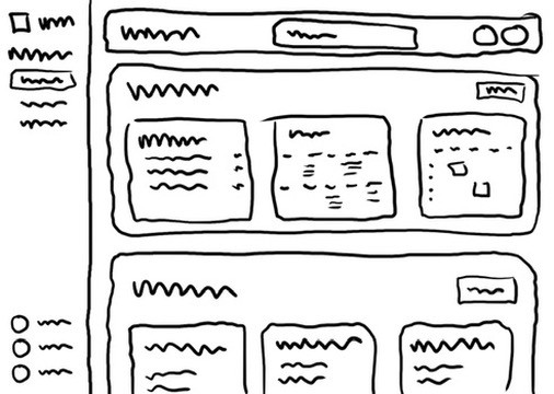
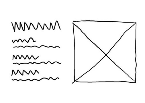
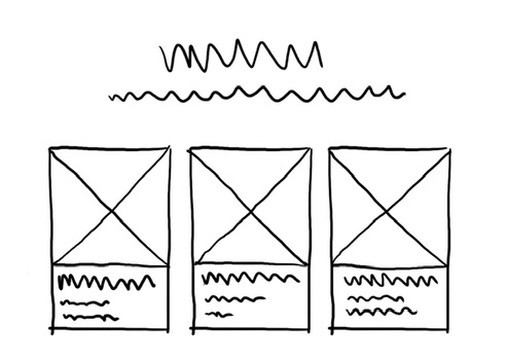
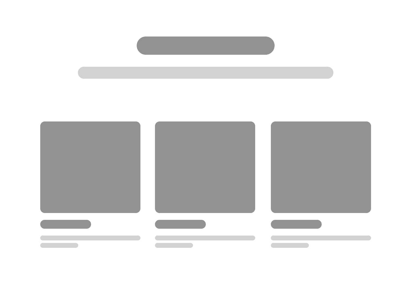
Main Dashboard Ideas
I experimented with different layouts to organise tasks and deadlines across multiple contexts.
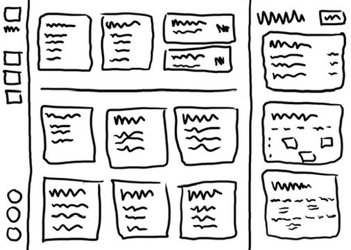
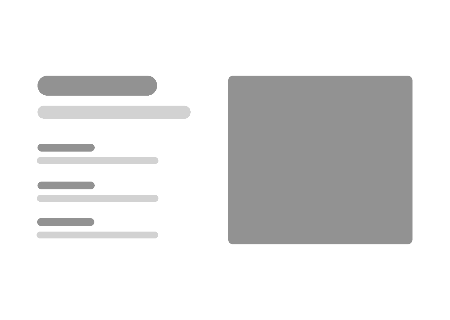
Landing Page Wireframes
After exploring initial sketches, I translated them into wireframes to better visualise the structure and flow of the interface."
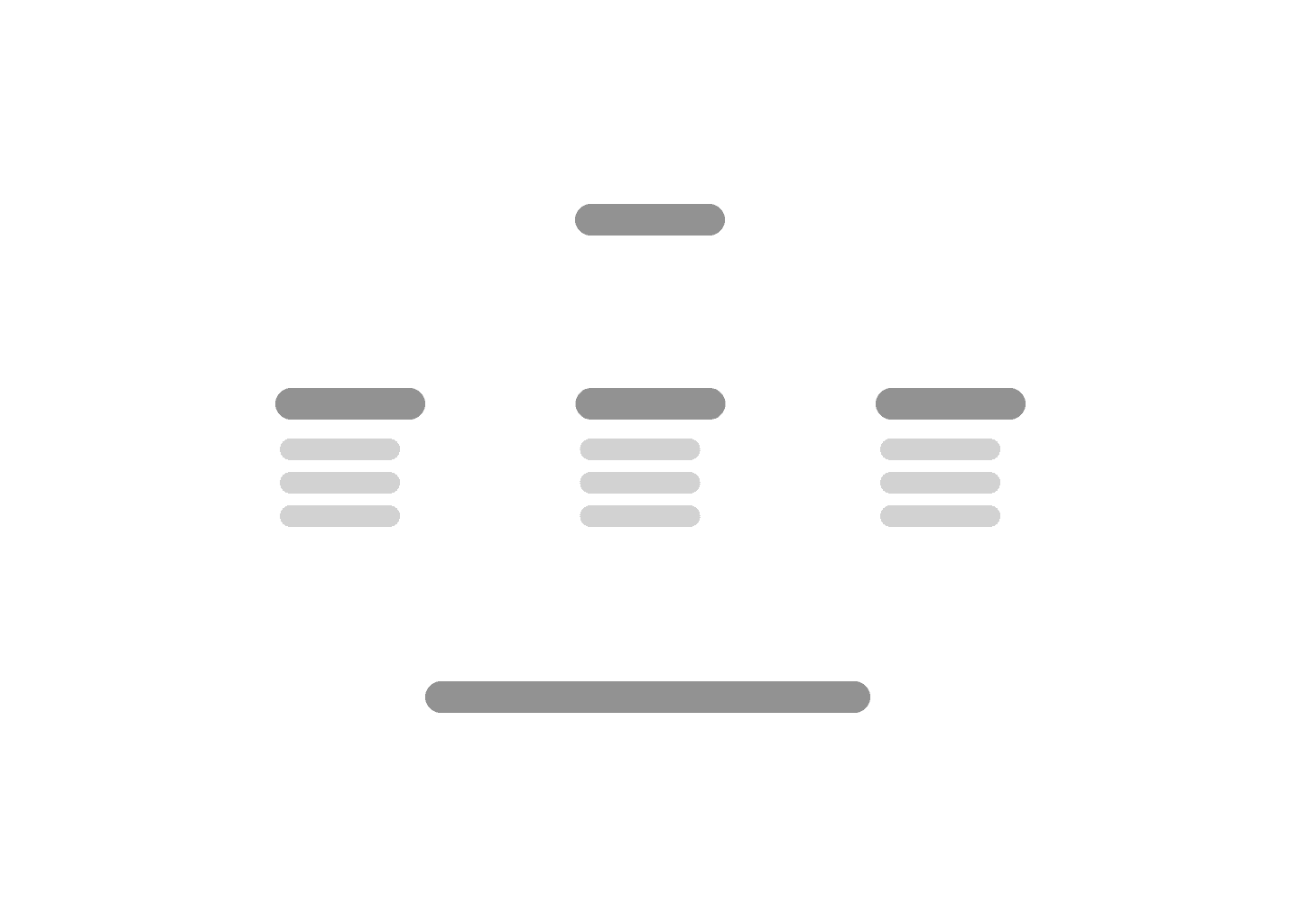
Dashboard & Widget Wireframes
These wireframes helped me visualize how a fully populated version of Swidge might look, guiding the final UI


Design System
Creating a minimalistic style for productivity
I designed the style guide to be clean and minimal, aiming to support productivity by keeping the interface calm, intuitive, and distraction-free.
ICONS
FONTS
LOGO


BUTTONS
COLOURS
LAYOUT
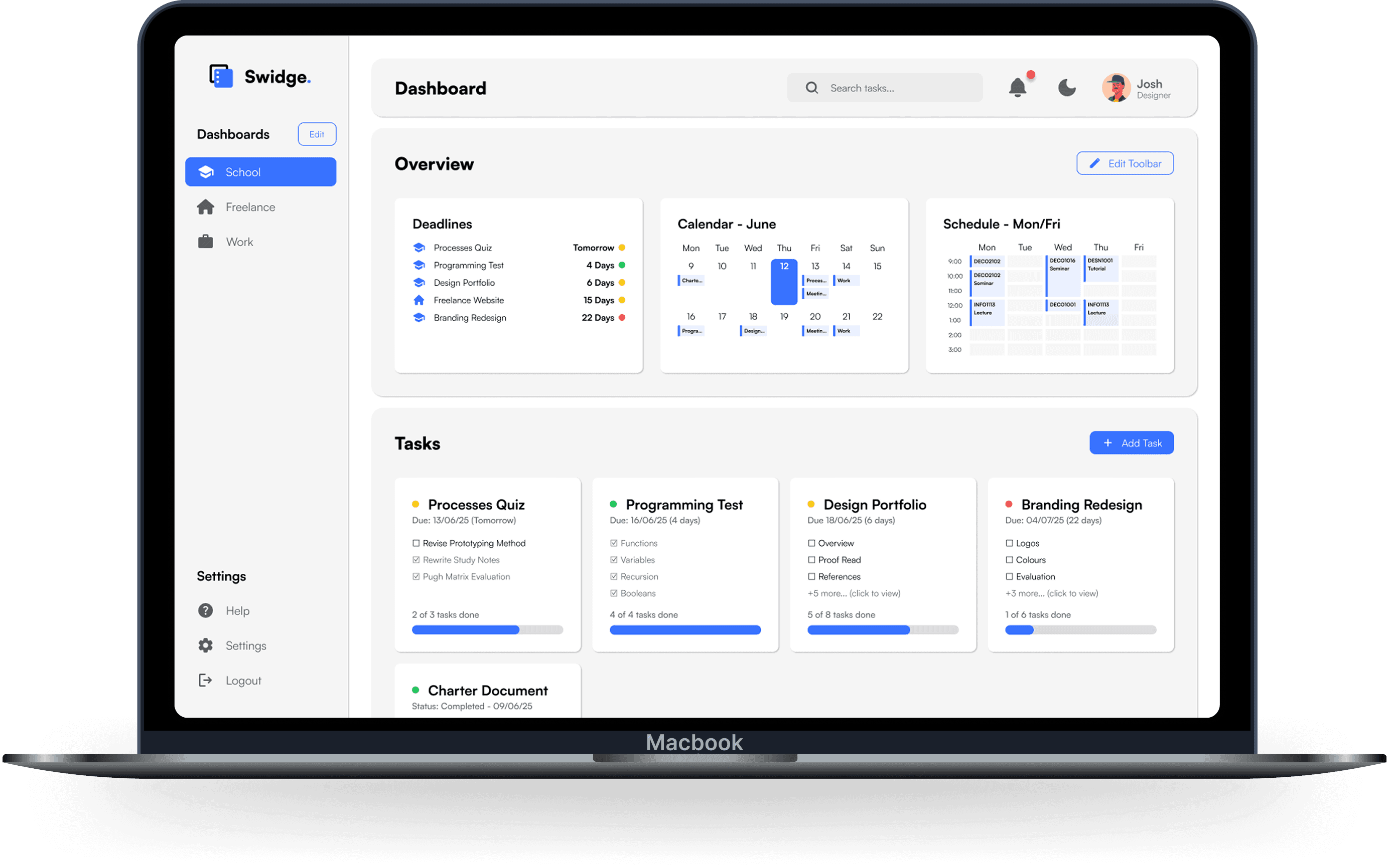
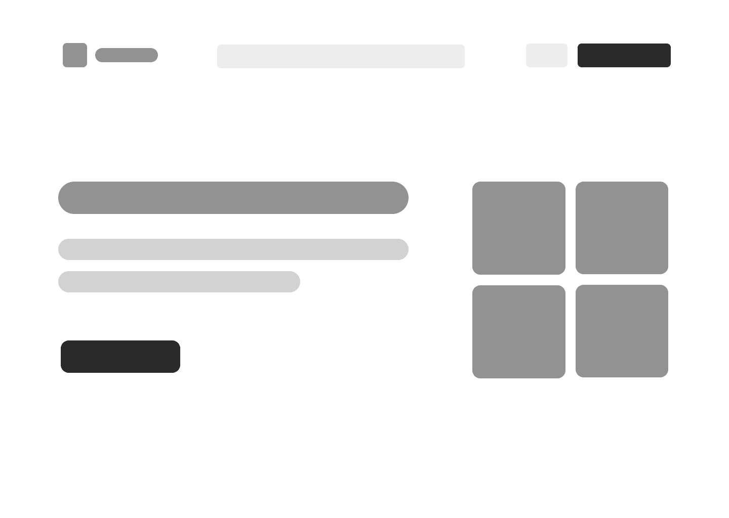
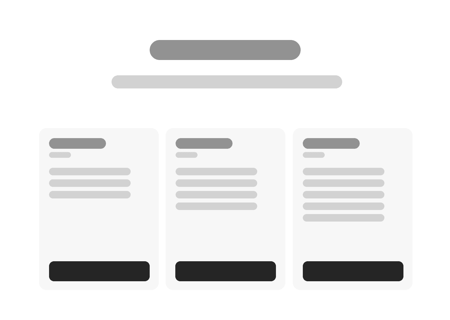
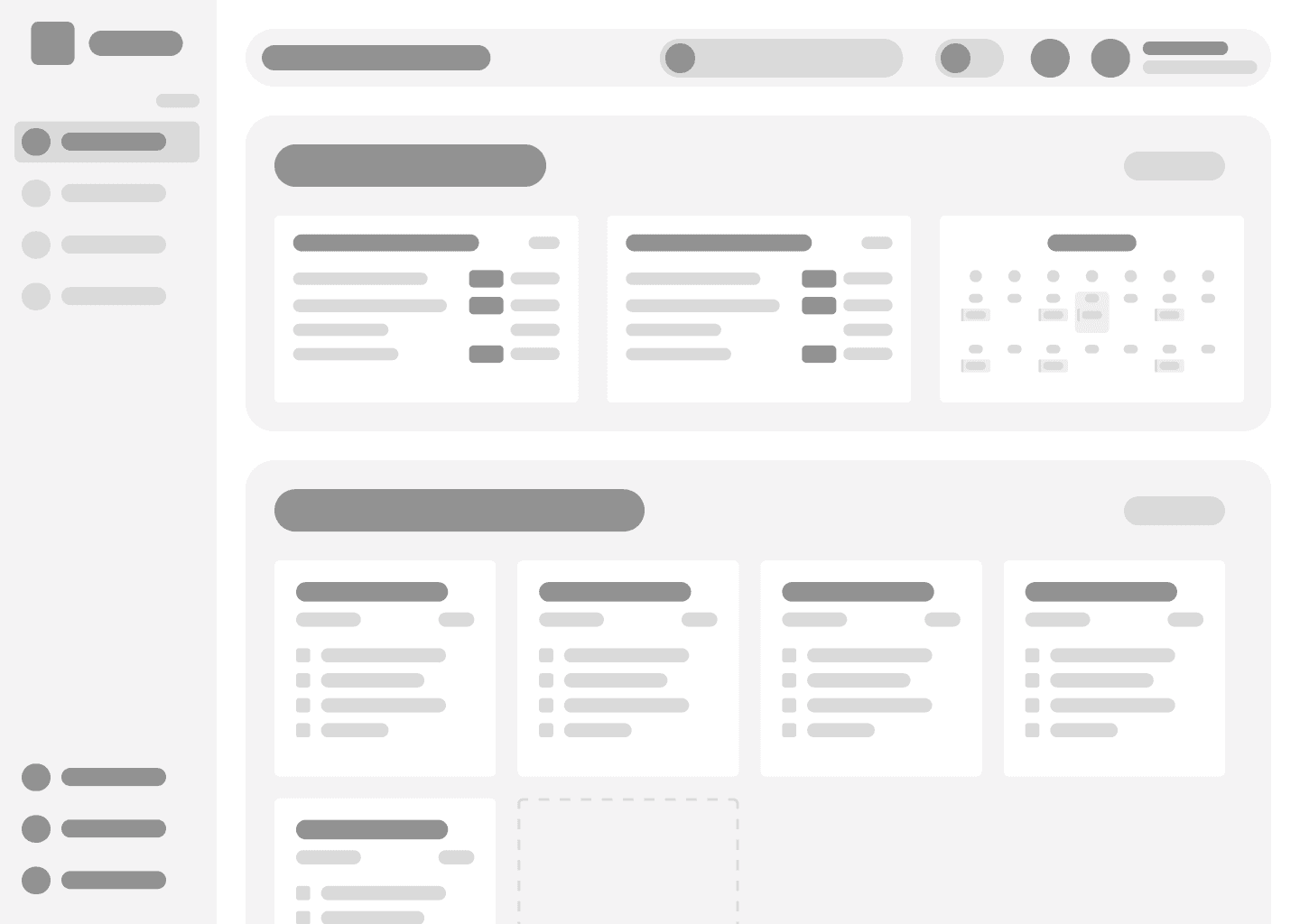
Final UI
Bringing it all together
The final interface captures Swidge as a whole. A minimal, modular tool designed to simplify deadlines across any context.
Landing Page
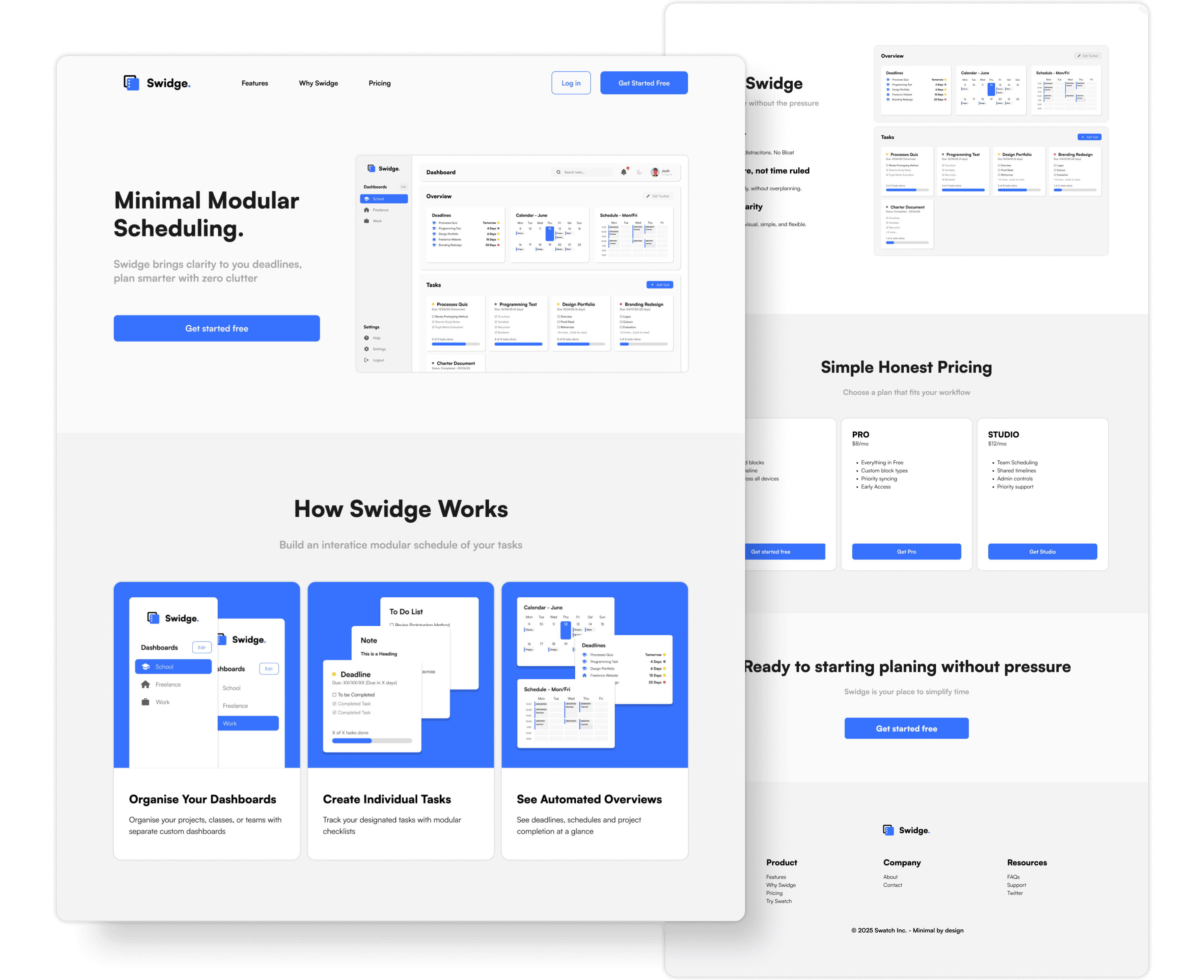
Main Dashboard
Reflection
Creating a case study has its difficulties...
One of the most rewarding parts of this project was seeing the final UI come together into something I’m genuinely proud of. I also found that leaning into my curiosity and using passion as fuel helped me push through the more challenging parts of the process. Once I got into a rhythm, the work became incredibly rewarding.
That said, I realised the value of sticking to the design process instead of jumping ahead to the "fun parts" too quickly. If I were to do it again, I’d start with deeper research and validation early on. Spending more time understanding users upfront would’ve helped shape stronger, more focused decisions later. Another big challenge was choosing what to show, countless research and design fails went into this project, it was difficult picking what is important to showcase.
This project taught me how to structure the UX process from start to finish. I learned that what first feels overwhelming becomes manageable once you just start, that was a huge personal takeaway. I also picked up countless UI/UX techniques, from broader design fundamentals of information hierarchy to technical tricks like harnessing auto layout in Figma. Creating a style guide, in particular, helped me design with more consistency and clarity.
Above all, this was a reminder that progress happens step by step, and that good design isn’t about perfection, but about having intention.