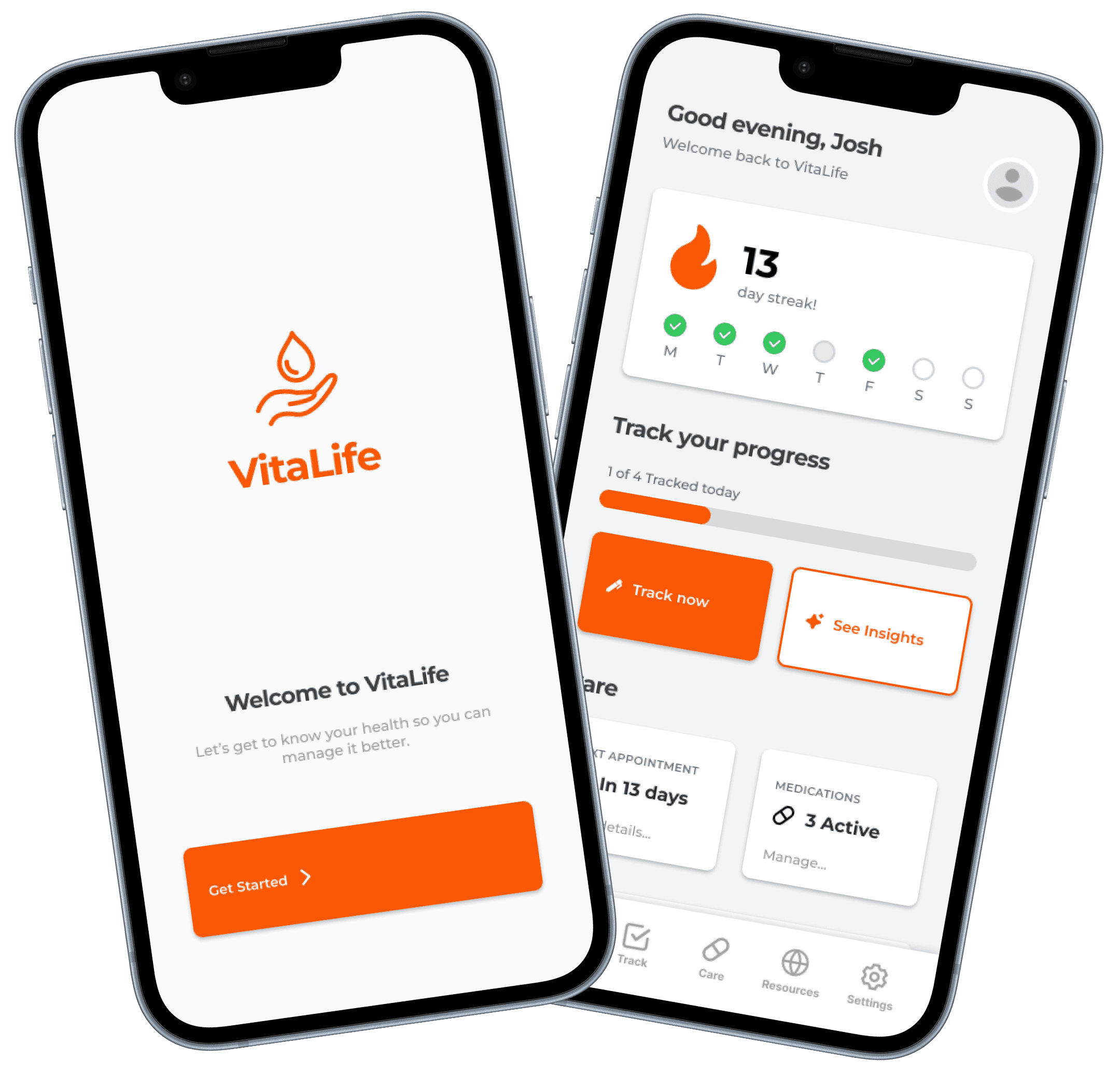
Vitalife
Your everyday tracker for managing eczema with ease and insight.
Type
Solo Project
ROLE
End to end UI/UX process
TIMELINE
12 Weeks
PLATFORM
Mobile App
Problem
Eczema care is fragmented, making it difficult to see the full picture and find correlation
This project focuses on designing a health management app tailored primarily toward individuals with eczema, while remaining adaptable to other chronic conditions. The app aims to create a unified platform that simplifies symptom tracking, supports day to day health management and provides personalised condition specific insights.
Solution
Connecting the dots through actionable insights while tracking what matters daily

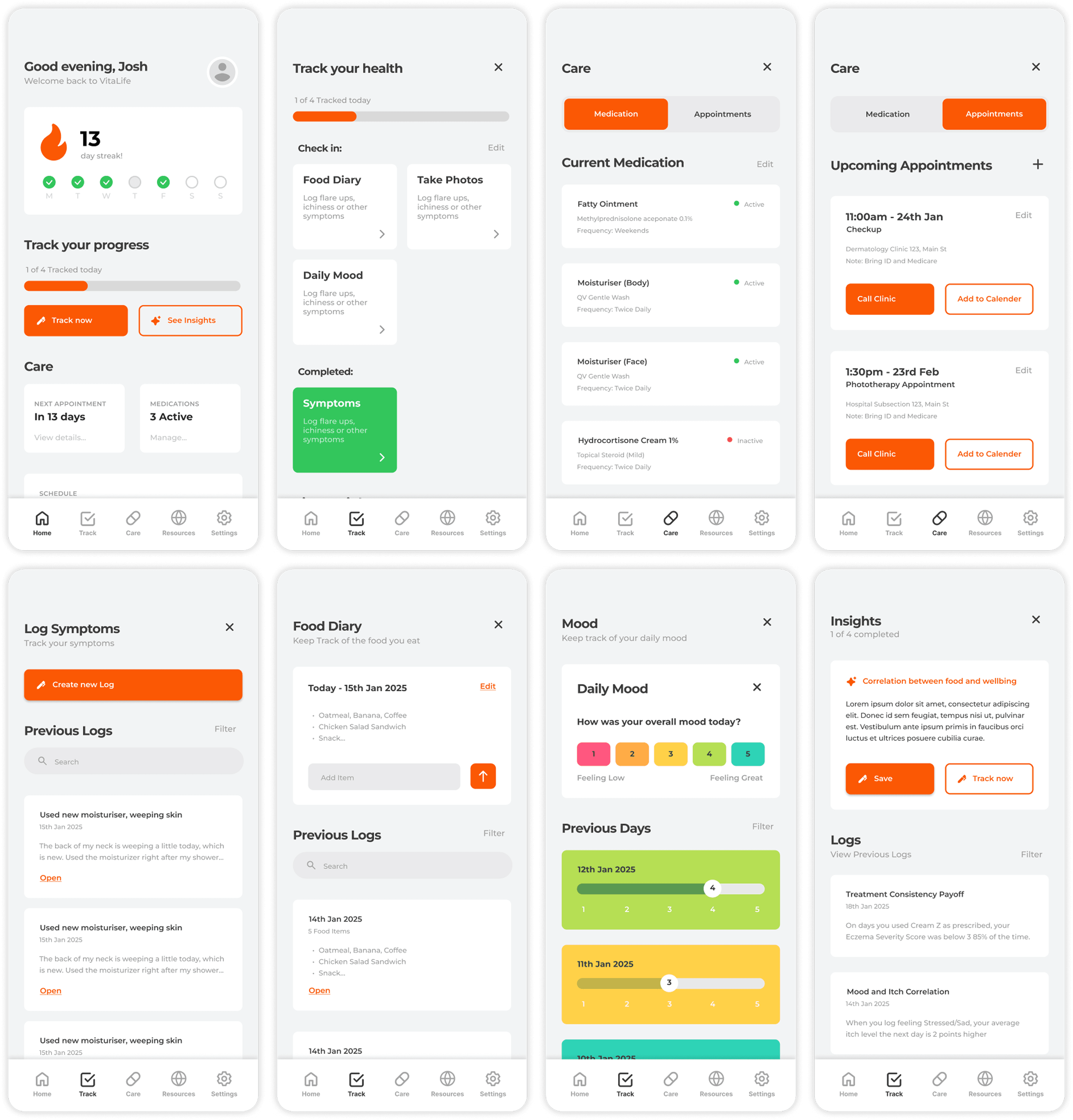
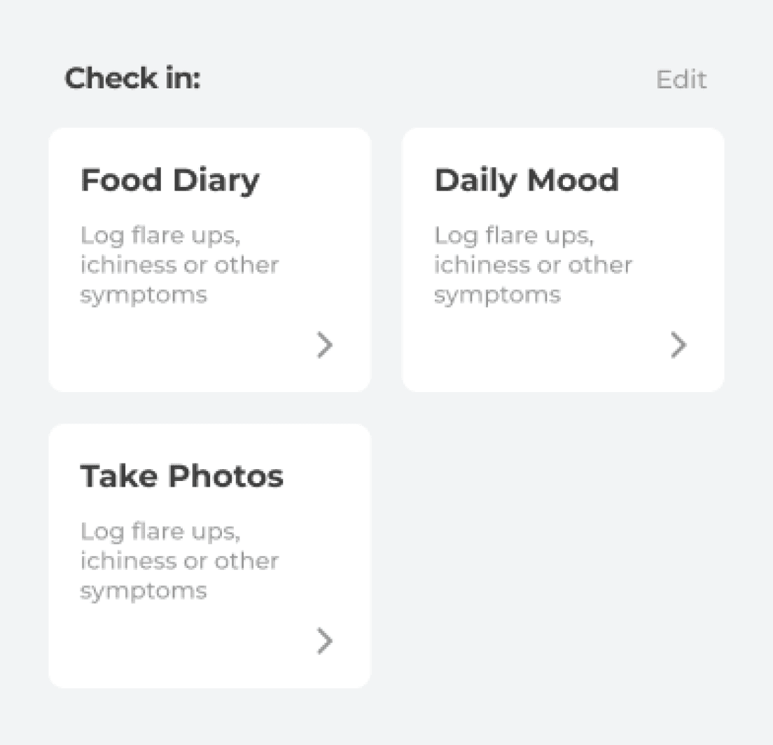
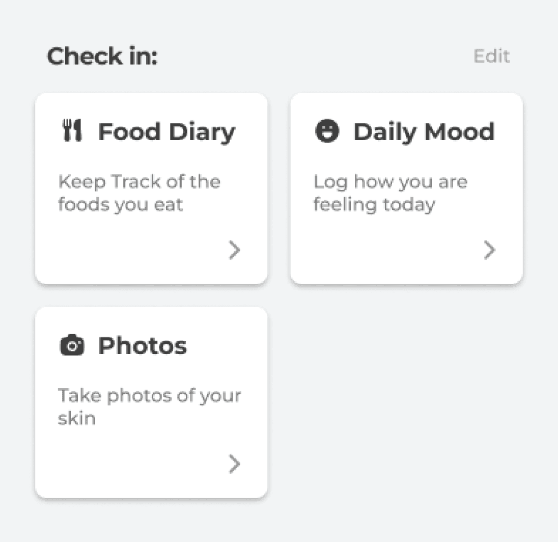
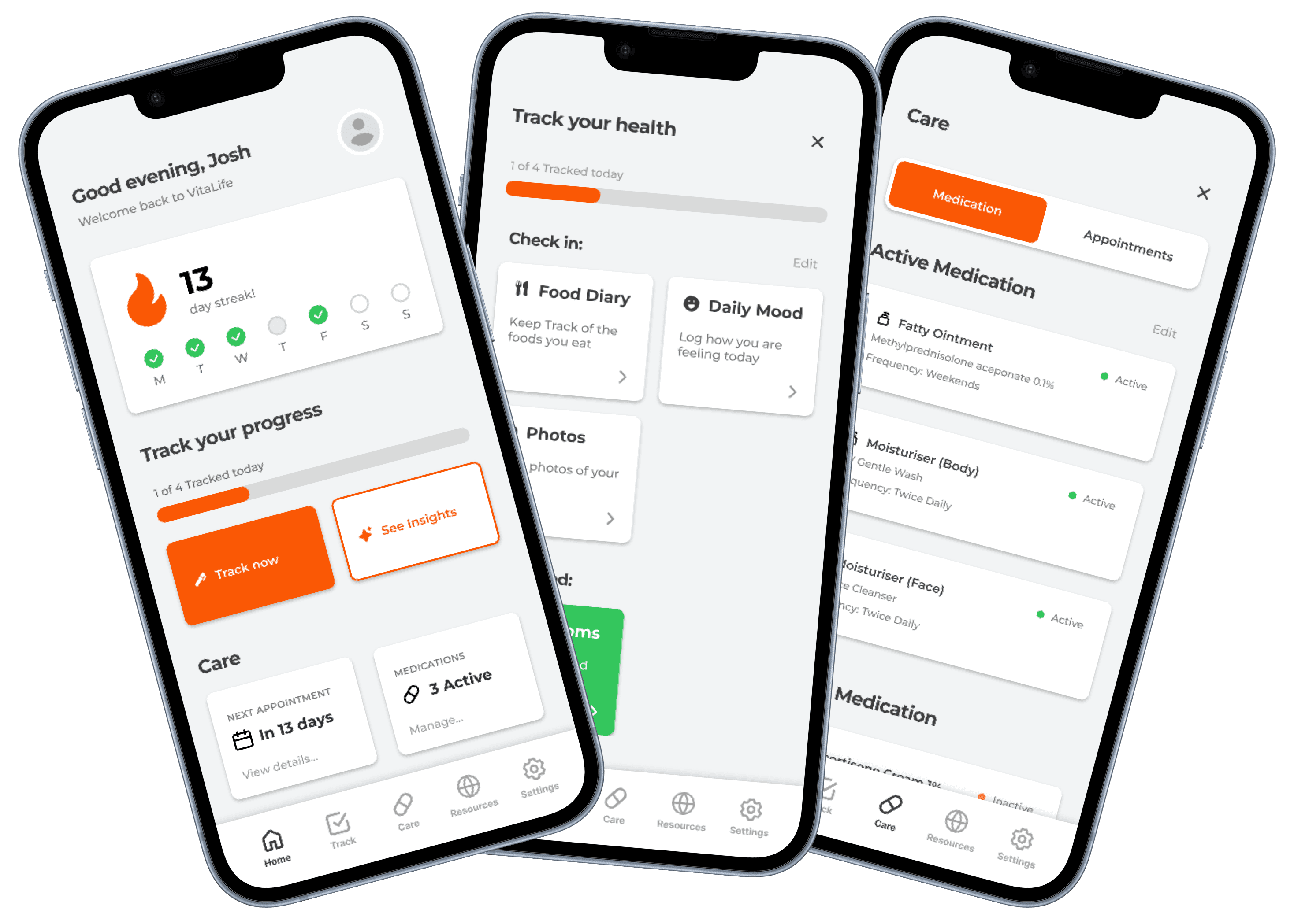
Choose What To Track
Pick what matters most and track only what you need
Log symptoms daily to keep streak and stay consistent
Edit trackers anytime by adding or remove items
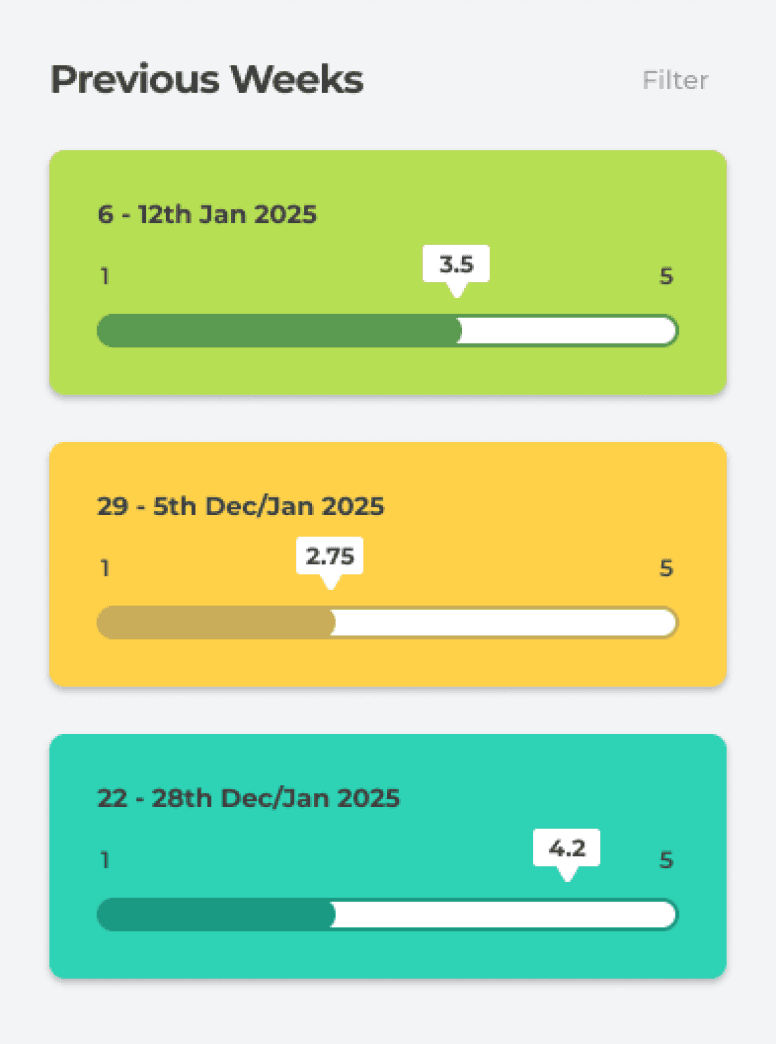
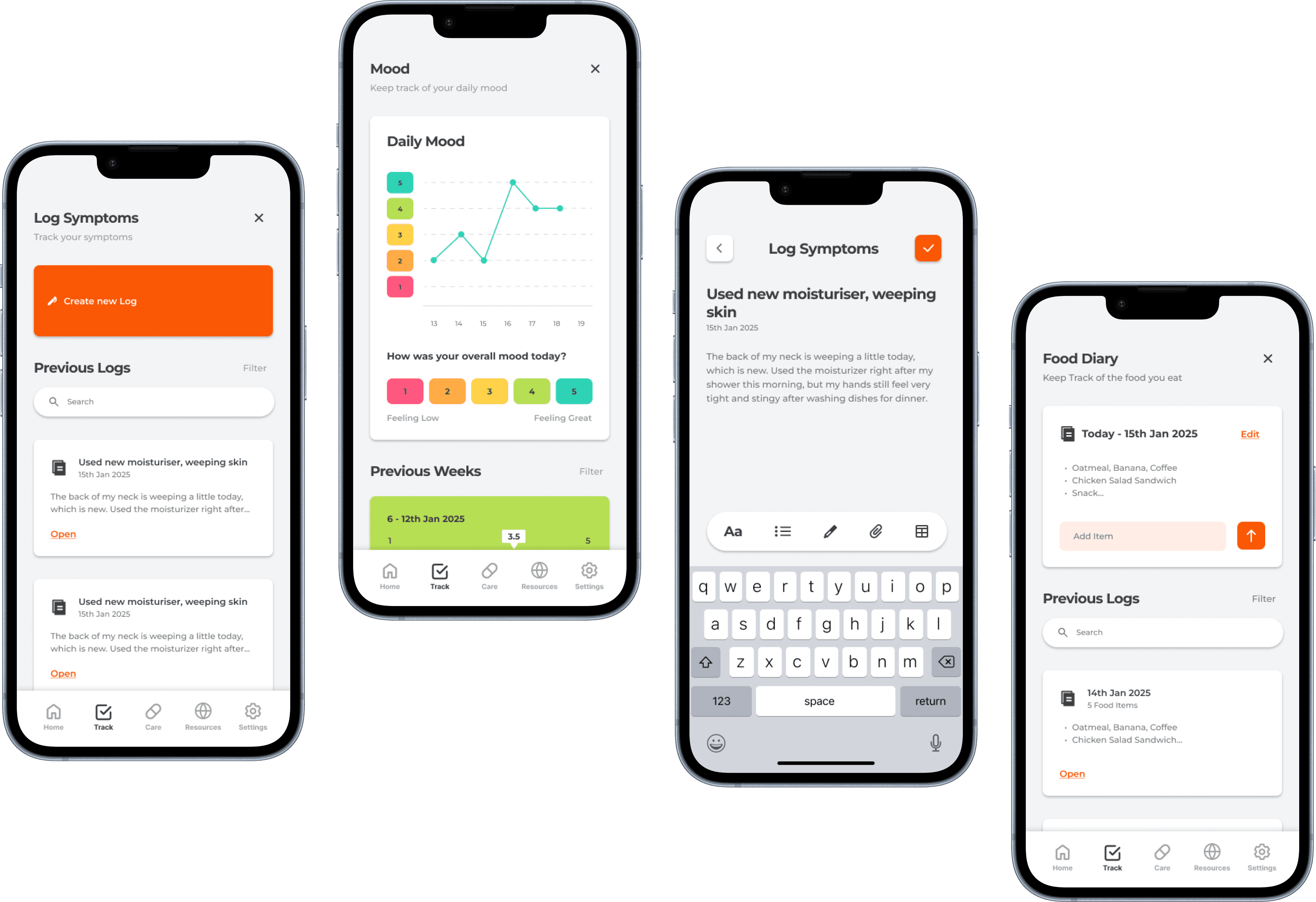
Log Your Symptoms Each Day
Daily symptom logging by quickly adding notes
Track your history and see patterns overtime
Stay on track by seeing which entries have been completed


Generate Insights from Logging
Discover patterns and turn logs into actionable insights
Save and revisit insights anytime
Chat with an agent who understands your history
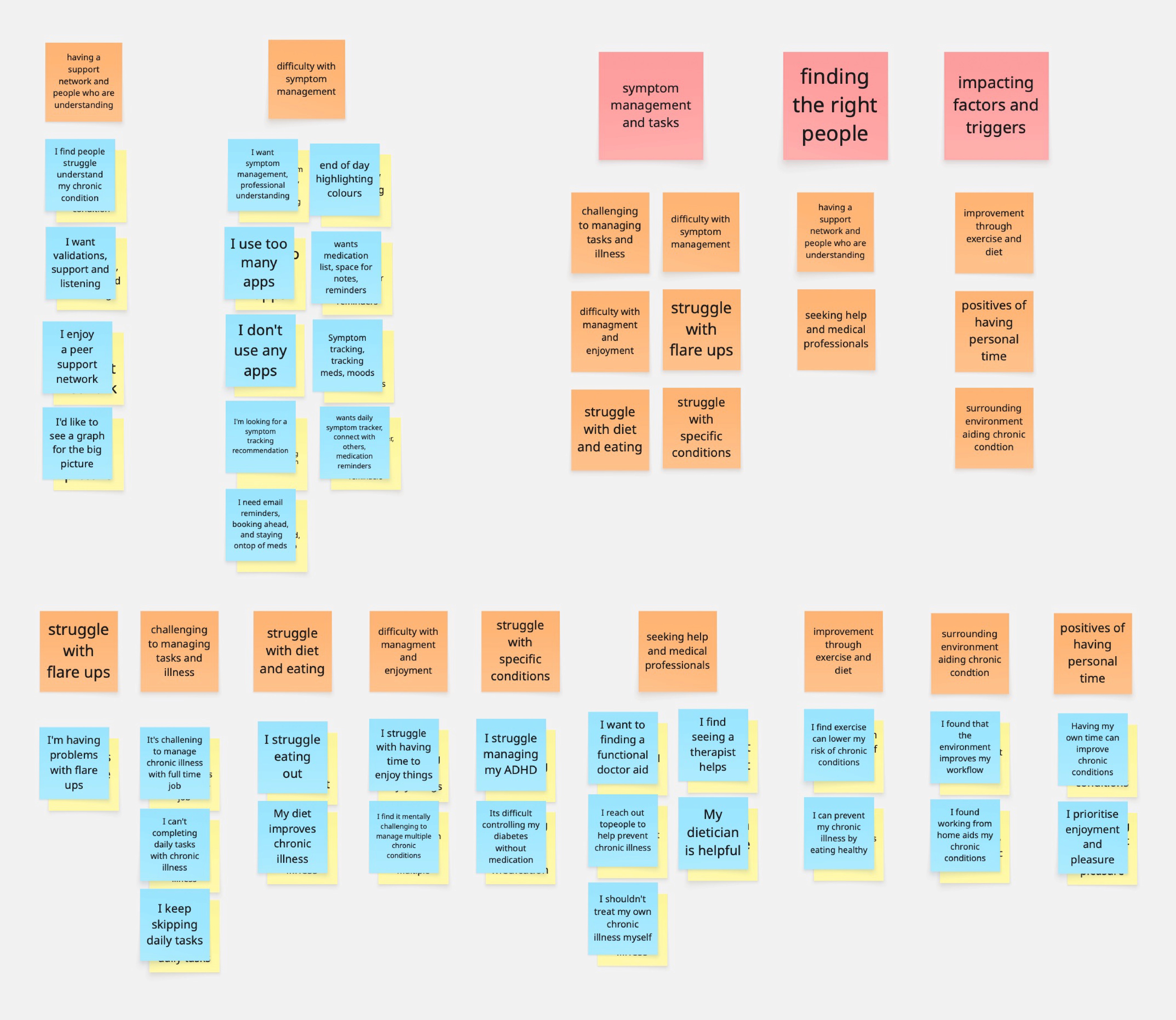
User Research
Online ethnography found patients struggle managing symptoms and tracking tasks
Ethnographic research revealed that patients often struggle ro manage the symptoms caused by their chronic condition and feel overwhelmed by the ongoing tasks and complexity of their illness. Many seek a supportive community of people with similar experiences and try to connect with the right experts for guidance. Additionally, identifying triggers and contributing factors is vital in helping patients reduce the impact of their condition, especially when a cure is not available.
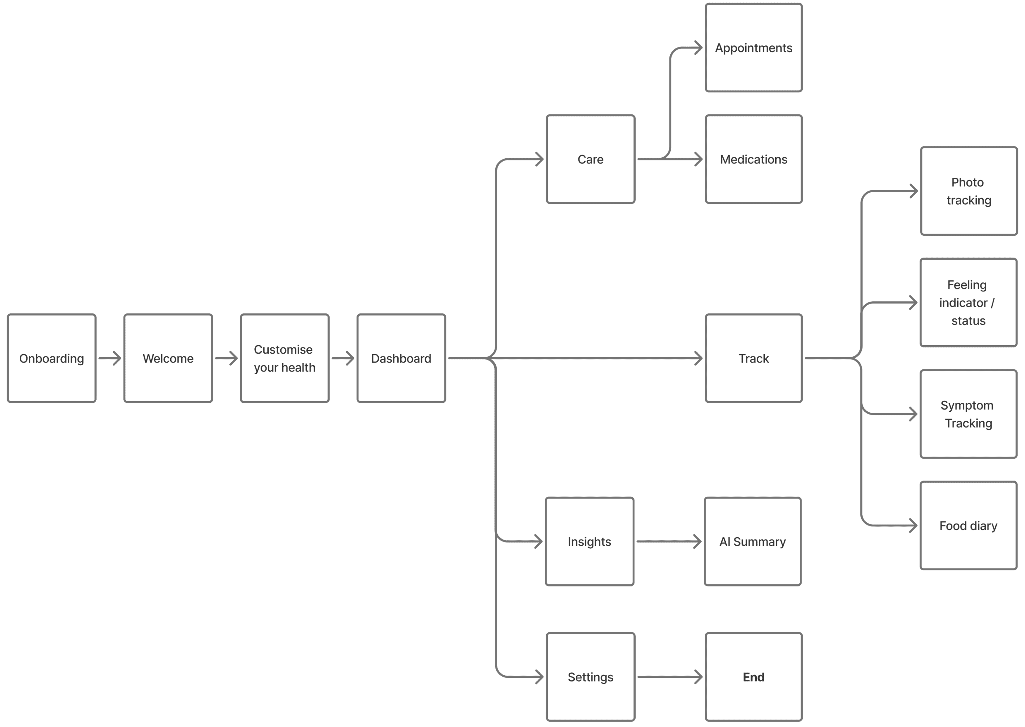
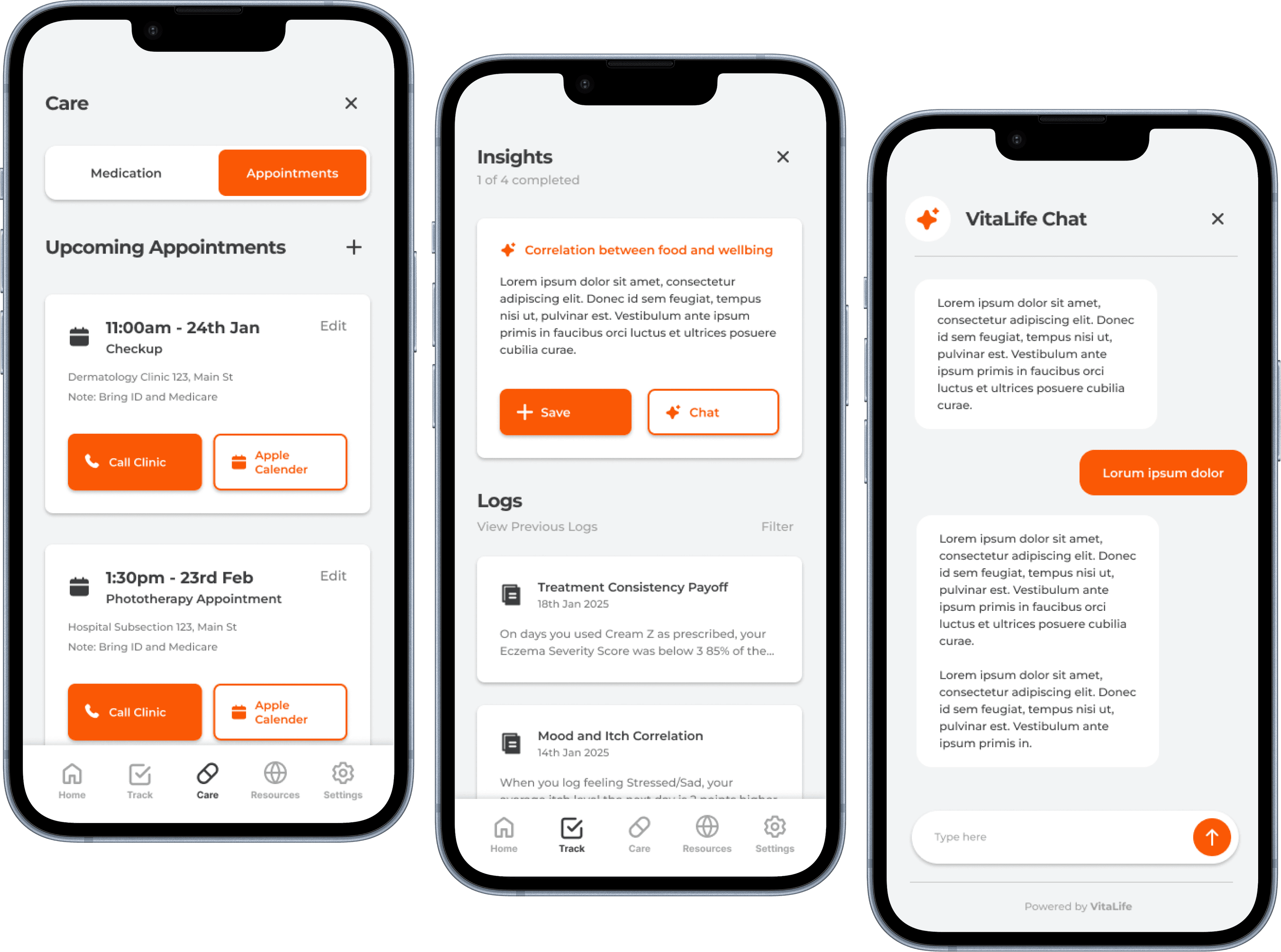
Information Architecture
Centralising where users track their symptoms, manage health and find triggers
From the dashboard, the app is split into three core sections: Tack, Care and Insight. In the Track section, users can monitor any condition related factors they choose. The Care section provides health management tools, including upcoming appointments and medication schedules. In the Insight section, users are guided to uncover meaningful patterns and generate actionable insights based on correlations within their tracked data.
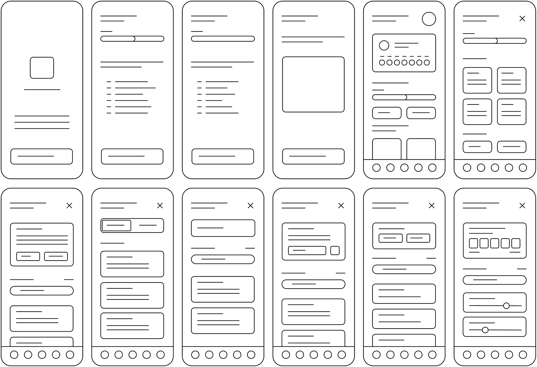
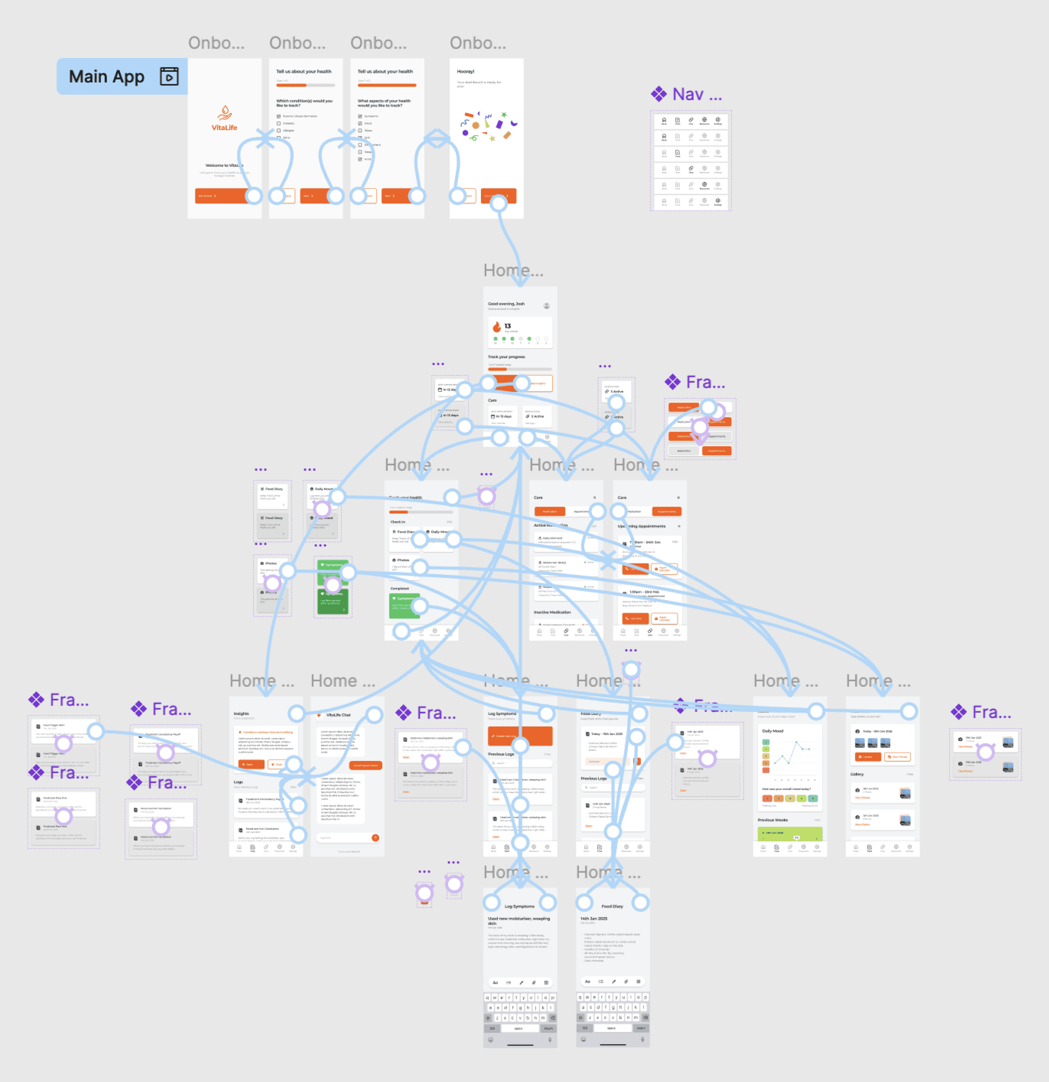
Wireframes
Visualising quick symptom tracking and personalised support
The wireframes established the foundational structure of the interface, defining both layout and content hierarchy. The main challenge at this stage balancing comprehensive functionality without overwhelming users. To address this, features were organised into nested subsections, enabling quick navigation while keeping each screen focused and manageable.
Design System
Balancing simplicity, accessibility and ease of use through standardising components
The design system established the visual direction of the interface, creating a cohesive experience that supports the purpose and goals of the app. It ensures accessibility through consistent use of outlined iconography, colours, typography and interactive components.
ICONOGRAPHY
COLOURS
TYPOGRAPHY
BUTTONS
PROGRESS BAR
TABS
SEARCH BAR
TEXT FIELD
INPUT FIELD
High Fidelity
Bridging into detailed and realistic screens from conceptualisation
As the designed moved into a higher fidelity, the app began to take clearer shape. A key challenge during this phase was applying the design system to the wireframes in a way that preserved the intended look and feel while still maintaining strong usability.
Prototyping
Building a functional interface with interaction and flows
As the designed moved into a higher fidelity, the app began to take clearer shape. A key challenge during this phase was applying the design system to the wireframes in a way that preserved the intended look and feel while still maintaining strong usability.
Usability Testing
User evaluation uncovered lack of affordance, consistency and accessibility
This stage involved moderated user testing and a post SUS evaluation form to gather usability metrics and identify improvement areas. The primary goal was to assess the app’s usability, navigation flow, and overall engagement in order to refine and enhance the user experience.
Moderated User Testing
3 users completing key tasks
One-on-one, in-person sessions.
Think aloud audio recording/notes.
Ease of Use Score
SUS Evaluation
10 item post usability questionnaire.
Generates an overall usability score.
Simple, quick, and comparable across designs.
Results
Results showed a need for clearer cues, consistent buttons, improved accessibility and stronger motivation to enhance the user centred experience.
Iteration
Improved usability, heightened experience and additional adjustments
This stage focused on thoughtful iteration informed by user testing to elevate the overall experience. Button affordances and layout structures were refined based on user feedback. Adjustments to font sizes, increased contrast levels and prominent shadows improved accessibility. Numerous smaller tweaks were also implemented in response to user stumbles and suggestions, ensuring a smoother and more intuitive interface.
BEFORE
AFTER
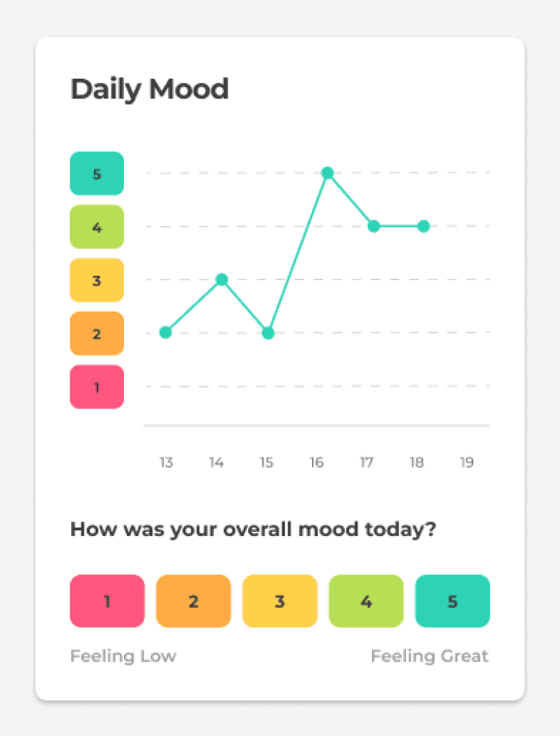
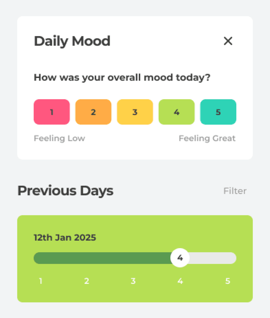
Visualised Daily Mood Graph and Removed Sliders
BEFORE
AFTER
Improved Shadows, Font Size and Iconography


Additional Adjustments
Mockups
An attuned health tracker grounded in research, testing and iteration
By following a structured design process, a fully functional health management prototype emerged. Backed by rigorous research, testing and iteration, the final outcome presents a unique and compelling solution to the fragmented experience of managing chronic conditions.
Reflection
Theres always room for improvement...
Looking back, the research phase of this project was both interesting and overwhelming. Initially my scope was extremely broad by trying to understand chronic conditions in general, but I quickly realised that narrowing my focus to a specific condition allowed me to go much deeper. More ethnographic research would have helped me uncover the subtle challenges users face day to day and connecting my insights more tightly to the design decisions could have made the concept even stronger.
The design phase came with its own set of challenges. Figuring out the layout of the interface and how to keep users motivated to engage with the app was harder than I expected. It pushed me to think critically about usability, interaction design and how small design choices can have a big impact on the overall experience.
One of the biggest lessons from this project was in prototyping and through components. Breaking the project down into manageable chunks, not just in Figma, but also in the way I approached the process overall was crucial. Iterating on small pieces at a time kept the project moving forward and made tackling complex problems much more manageable.
If I were to do this project again, I’d spend even more time in the research phase. I’d dive deeper until I truly understood the audience I was designing for. Creating something meaningful requires more than just a surface level understanding as you have to know your users inside and out. This project taught me that patience and thoroughness in research directly lead to stronger, more thoughtful design solutions.